The J curve, or: it gets worse before it gets better
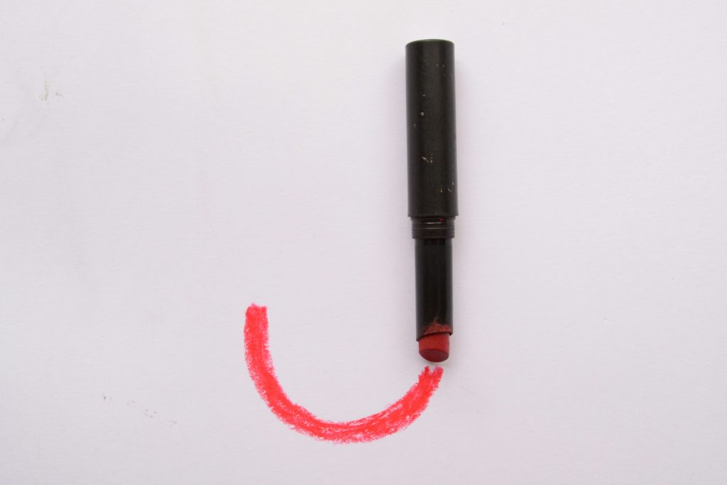
If you’ve ever tried to make something work better by adding or changing a process, you may have noticed that the something got worse. Whether that worseness surprised your or not depends on if you’ve heard of the “J curve” concept. A J curve is any graph that looks like the letter “J”: a sharp dip followed by a sharp rise.
The J curve in open source projects
The phenomenon appears in many fields — economics, medicine, and technology. Where might you see it in your project? Maybe you add automated tests to reduce the manual QA work you do pre-release. This should allow you to ship your releases faster. Except once you introduce it, you spend twice as much time fixing bugs because you find so many more. The next release ships slower. But once you’ve caught up, the benefits you expected appear. Bugs — particularly regressions — get caught (and therefore fixed) faster.
Similarly, you might start blocking changes that include vulnerable dependencies. This should improve security for your users. But the first time, every dependency is full of vulnerabilities. This, at least, makes the apparent security worse. And maybe the actual security as you take time to prioritize and fix vulnerabilities in dependencies that would have been “accidentally” fixed in routine updates anyway. Again, after you have a handle on the situation, the process works as intended.
Progressing through the curve
Recognizing where you are in the curve is important to navigating it. Are you still on the downslope? Have you leveled off? Are you on the way up? If what you’re trying to change is measurable, then tracking those measurements will help. Of course, not everything is easily or meaningfully measurable. In those case, you can trust your intuition. Do things feel like they’re still getting worse? Better?
The main thing is to make everyone aware of the J-ness before it starts. Acknowledge that things will get worse for a little bit and then you’ll see the improvements. Avoiding surprise is the key to keeping people engaged, and keeping people engaged is the key to seeing the change through and not ending permanently in the “worse” state. Unfortunately, it’s hard to answer the “how much longer will it take?” question; there’s no magical way to know how long the curve is. Which leads us to…
Limits of the J curve
The J curve is a useful concept, but it’s not an inviolable law of physics. While there are plenty of reasonable explanations for why the J curve phenomenon occurs, there’s no guarantee that it will. Just because you think it will, does not mean it will. Sometimes, our ideas for making things better don’t work.
As I said above, you can’t predict where you’ll go next — even if you’ve been meticulously tracking the thing you care about. This, combined with the “it might not get better” aspect, means you could be on an endless march into darkness. At some point, you have to decide it’s time to bail out.
So what do you look for if you can’t predict the future? Let’s go to calculus class for a moment and think about the second derivative. In other words: the rate of change of the rate of change. If you’re really on a J curve and not a ramp into hell, the second derivative should become positive pretty quickly. (“Pretty quickly” is relative to the scope and impact of the change.) Even if things are still getting worse, you should see them getting worse more slowly. As long as the second derivative stays positive, you’re on a good track.
Finally, and what I’ve often seen ignored, is the fact that the upward part of the J doesn’t continue forever. At some point, you’ve maximized the gains you can see from that change. That’s fine. Contrary to investor beliefs, things do need to level off at some point. The Satir Change Model, developed by family therapist Virginia Satir, is a good representation of a realistic J curve, complete with a new equilibrium state at the end.
This post’s featured photo by Zyanya BMO on Unsplash.